Following my work on the inauguration of the Temple of Peace in Cardiff, I have become fascinated, and inspired by the women’s peace movements that have taken place in Cardiff during the past century. The stories of the people depicted in my latest series of linocuts will be the subject of my next blog. However I have been taking photos as I go along, so I thought I would share them here for those who might be interested in my process.
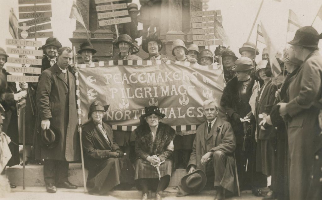
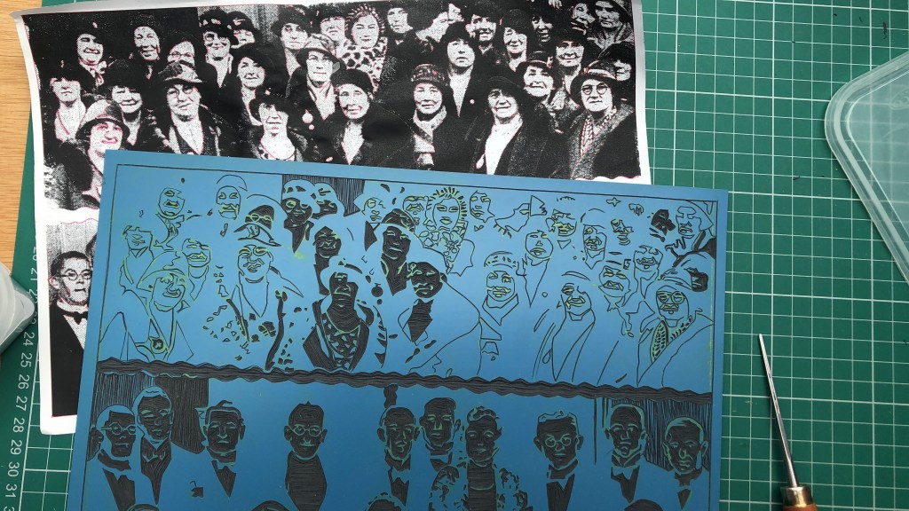
Original Photo
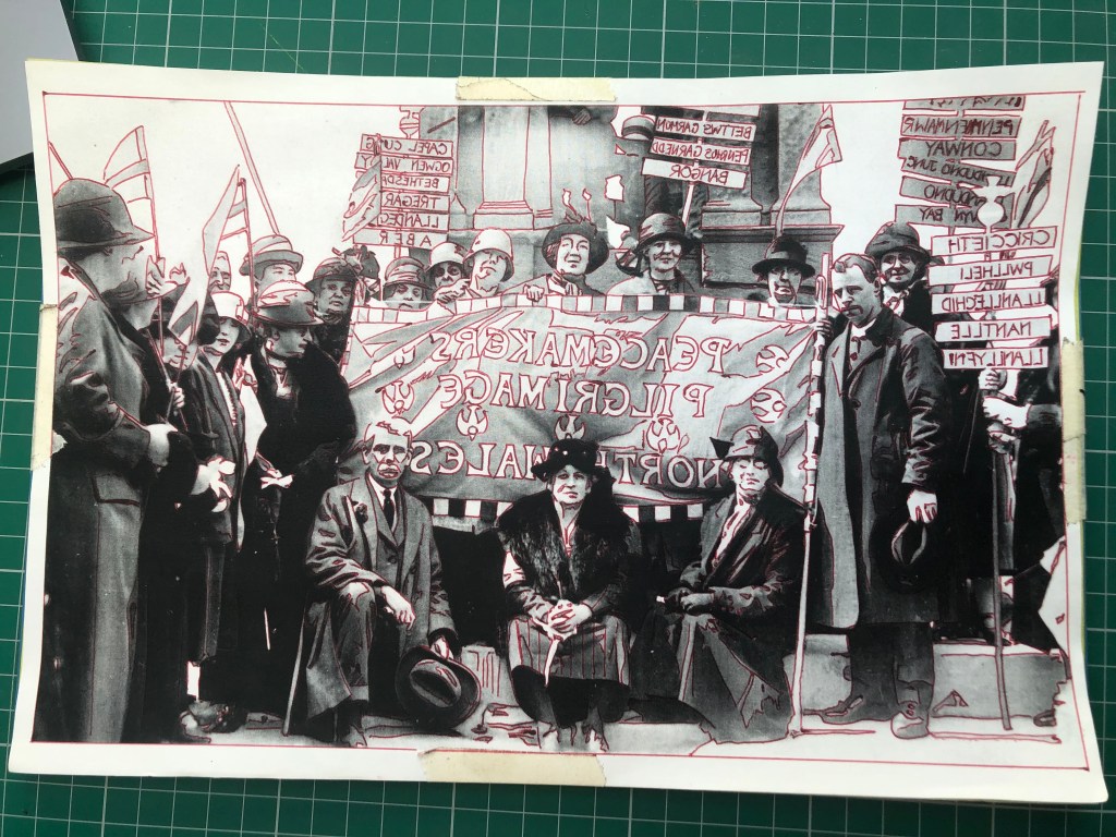
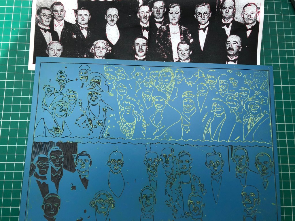
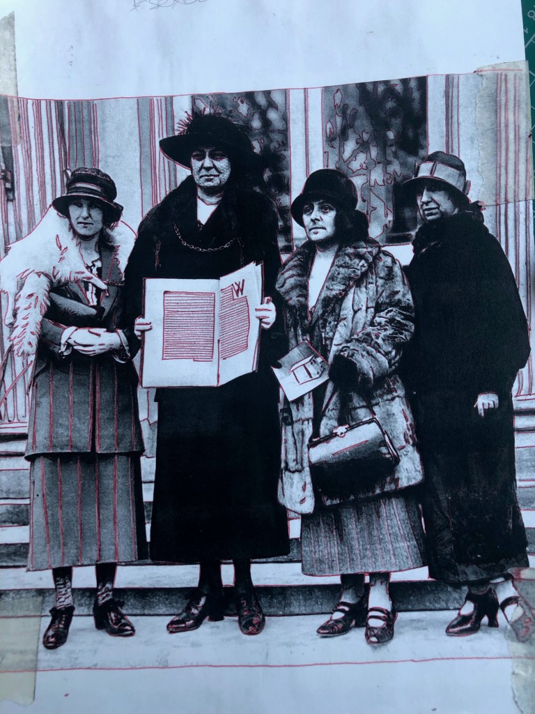
I import the original photo into my computer and manipulate it to accentuate the contrast and remove some of the greys. I print it off at the right size for the linocut, having flipped it (to ensure that the final print is the right way round). Under the printed out image I put Tracedown which is a kind of waxy carbon paper for craft projects. Then I tape it all together to keep it from shifting about. I trace the image onto the block with a red biro, as that makes it easy for me to see any areas I have missed. Each stage involves making decisions which further simplify the image which makes cutting easier, and enables the final image to be nicely abstracted from the original.
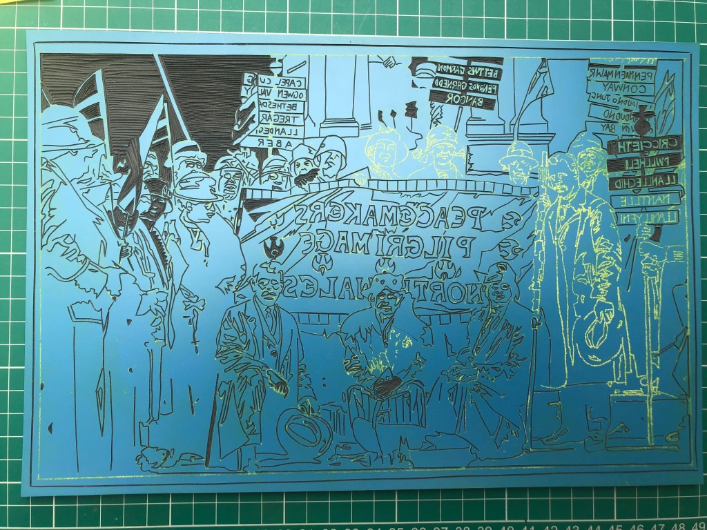
The cutting begins. It is really hard to concentrate on one task at a time, so I take turns between carving out the yellow lines (made by the Tracedown wax) and the less taxing clearing of larger spaces (in this case the sky). The lettering is so satisfying too, but it is easy to make mistakes so I did it in small blocks to ensure I was fully concentrating. Where I am not sure if I want the black of clothing (say) to bleed into a black background, I leave the line untouched. It is always easy to cut out more to help ‘read’ the image. But once it’s gone, it’s gone!
The faces are a real challenge and so I have learnt to go very slowly. It is useful using a historical image as you don’t have the person depicted looking critically over your shoulder for accuracy (or a flattering portrait). However I made some critical errors here. Most clearly seen in the three ladies above the banner to the right of the block. I decided that they could have white features carved out of black faces as they were further back in the image and therefore less clear, in much the same way as the lettering in the background is reversed out. The faces looked terrible, and I had to do a hasty repair job to salvage them.
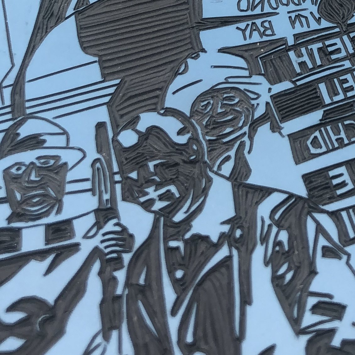
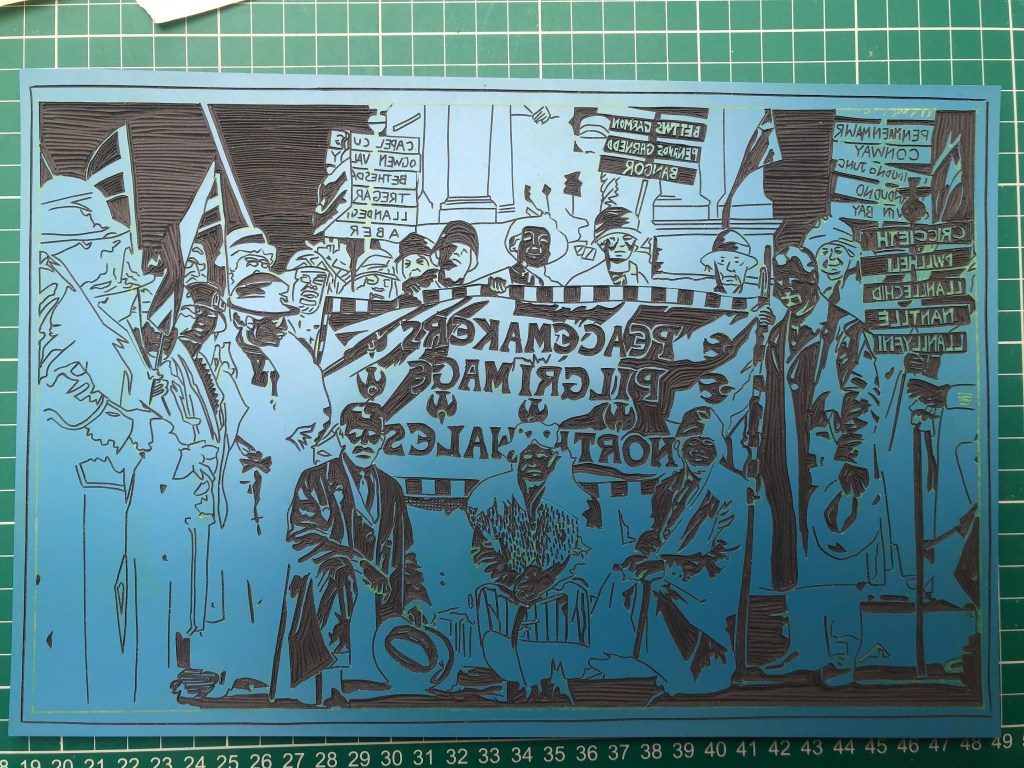
In order to salvage the faces I had to cut out a lot more lino, and lose the features where I had previously cut. Therefore the final images are a bit cartoonish and distorted. But much better than my first efforts!
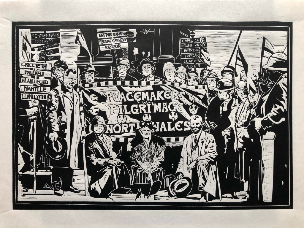
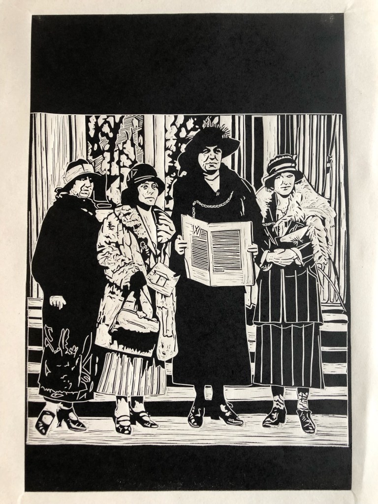
Final image
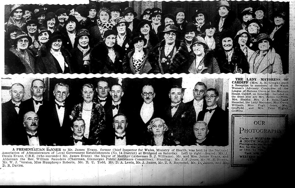
This photo is a cutting from the Western Mail. I chose it following my struggles with faces in the previous image. I decided it would act as the kind of ‘etudes’ written by composers to help musicians to improve technically. Because of the ‘halftone’ technique used to create images at this time the contrast is already perfect for me as the contrast is high and some of the detail is lost.
A lot of concentration went into this plate. So I was working in three different areas at once to prevent zoning out and making mistakes. The yellow wax is untouched at the top right which gives me some initial cutting out to do. Where I have cut out the people I have done each face as part of the whole body. Normally at the beginning of a session when I am at my freshest. The third element is the clearing (shirts and backgrounds mainly) which help the unscrambling of my brain. While I was working on this plate my father had a stroke and went into hospital. I took my work with me while I stayed in his flat for a couple of days. The intense concentration was hugely therapeutic at such a worrying time.
Once the features are carved in outline the magic begins as the faces get cleared and the expressions reveal themselves.
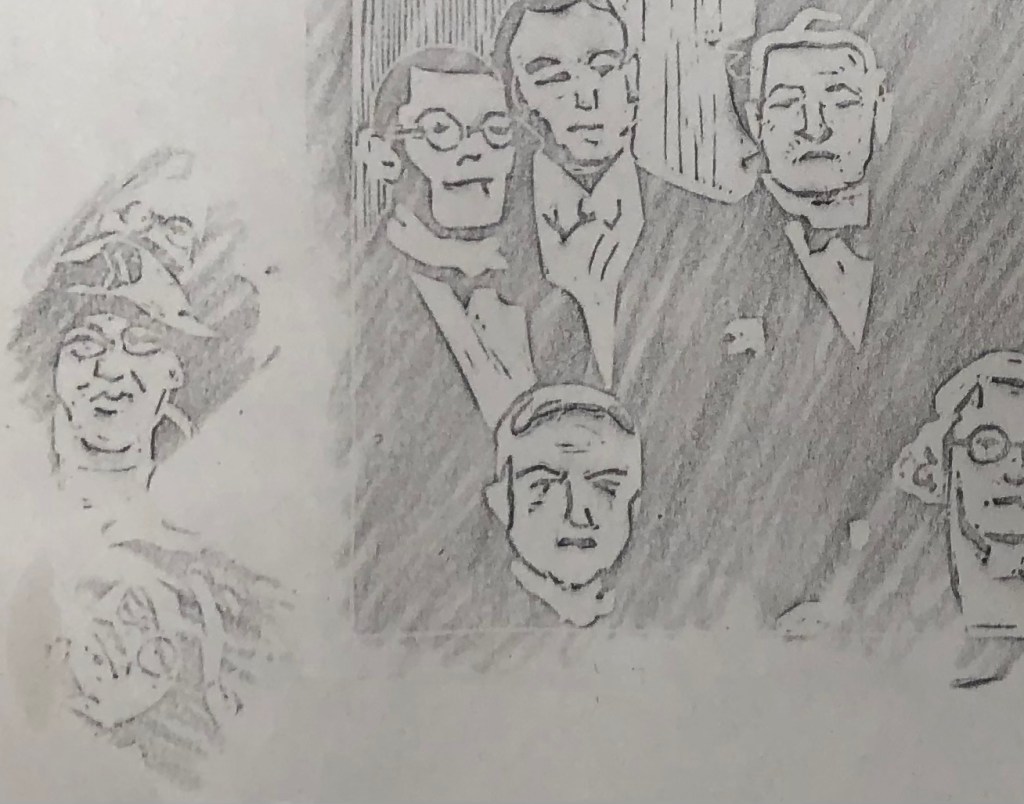
To see how the faces are working, I use a graphite pencil on newsprint to have a sneaky peek…
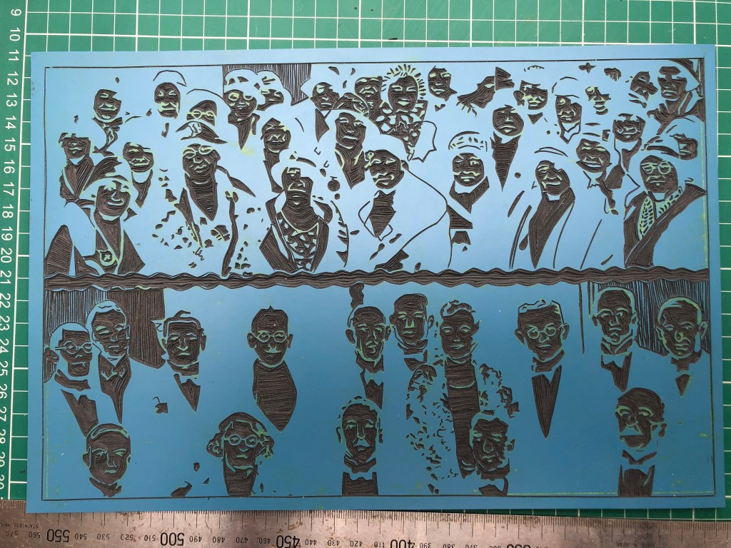
The block completed

Final image. This was a huge challenge for me, and some faces are definitely better than others. But so gratifying to see some individuality in expressions shining through!

This image had some new challenges for me. How to depict the background texture and the raised stamps. Also the flatness of Annie’s image and the need for an accurate representation of her face. But I do love lettering of which there is plenty of variety here, and how could I resist trying to recreate her signature.

I left the face until last on this occasion and traced relatively little in order to allow me maximum flexibility when carving.

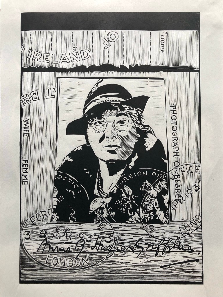
After much thought I decided to cross hatch Annie’s face to give more shape. I thought it would be too flat otherwise. I think of linocut as being much more black, white and blocky than an intaglio method like etching, but on occasion it can be really effective.
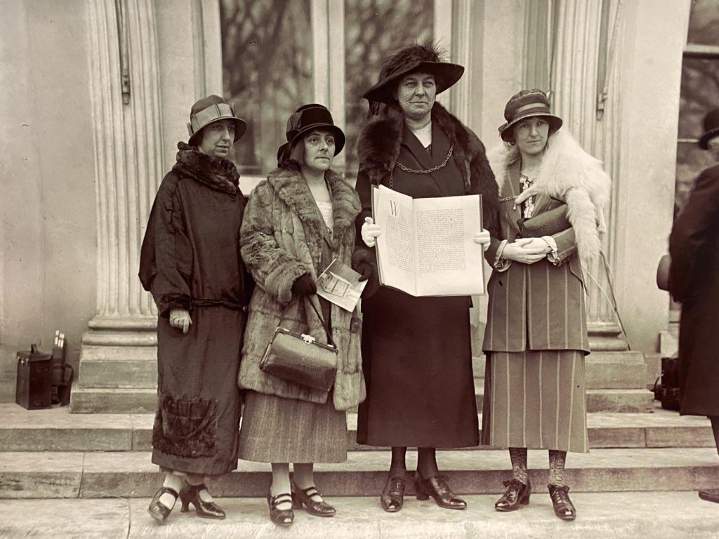
I left this image until last. While it had many of my favourite items like shoes and hats, it was a flatter image with some difficult textures (fur!) And the faces really mattered. Having done the first three images gave me the confidence to go for it.
I got lost among the lines of the columns on this one which were surprisingly difficult to render. The writing in the book was tricky as well. Annie’s net across her hat was a step too far, so I left it out!
On the next blog I’ll be putting together the history behind these fantastic photos, and giving due credit to the people who helped me out with the source material.

Fascinating to read about the technique, and also to see the problems and progress along the way. The final image is my favourite – it’s got a really strong aesthetic.
LikeLike